
As a Baseball Prospectus reader, you’re undoubtedly familiar with charts like this:
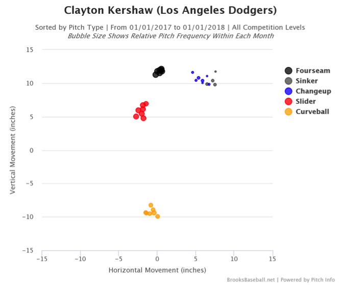
That chart, popularized by the website BrooksBaseball.net (which is run by Harry Pavlidis and Dan Brooks), shows pitch movement for a variety of pitches. You may have also seen this same chart with the X and Y axes clearly marked, showing pitches that move up or down relative to a “spinless pitch”—as in this example from former BP writer and current Houston Astros Director of Research and Development Mike Fast:
This paradigm for describing pitch movement focuses on short-form movement, and that’s what we’ll call it moving forward. Why is it called short-form? Well, this method of displaying movement compacts the window we view pitch movement through to compare all pitches to an origin that would be created by a pitch with 100 percent gyro spin–that is, a pitch with no spin-induced movement.
This gives us the familiar look of fastballs that move “up” on account of their backspin, and curveballs that drop on account of their topspin. Frankly, it’s a clever way to display pitch movement because it clearly highlights how spin begets magnus forces, which begets movement.
There’s just one problem with only ever viewing a pitcher’s arsenal through this lens: it doesn’t reflect reality. To better reflect the actions of pitches in the real world, we need to look at long-form movement. It’s much less likely that you’re familiar with a long-form movement chart, so let’s take a look and see how it compares to its more popular sibling:
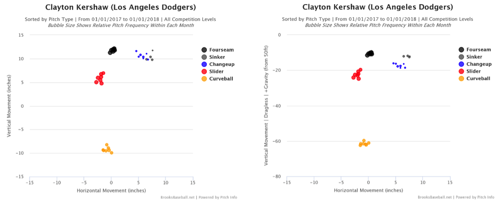
On the left is the short-form movement chart from above, and the right is the long-form chart. At first blush they look exactly the same, but let’s late a deeper look. The short-form chart ranges from -15 inches to +15 inches on the Y-axis, while the long-form chart ranges from -80 to 0 inches. This discrepancy is a result of the long-form movement chart including the effects of gravity, which is why all pitches now drop below 0 on the Y-axis. The long-form chart illustrates the “fastballs don’t actually rise” phenomenon, while the short-form chart shows fastballs with a positive movement value in the vertical plane.
This effect is clearly illustrated through the relationship between sinkers and changeups on the chart. On the short-form chart, they appear to be one blob, with nearly identical movement. On the long-form chart however, there’s a clear break between the two clusters, as changeups drop as much as five inches more than sinkers.
In our pitch tunnels research, we came to the understanding that flight time difference, the relative speed difference of sequential pitches, was important to note. These long-form charts highlight that phenomenon as well. When you remove the effects of gravity, the movement of Clayton Kershaw’s changeup and sinker is similar. In reality, there’s an eight mph difference between the pitches. His changeup is in flight roughly 10 percent longer than his sinker, which means that gravity has longer to act on the pitch, resulting in more “drop” than you’d expect if you considered them to move the same.
Gravity imposes its will on almost everything, so it seems we would be remiss to ignore the role it plays in pitch movement. When you account for the impacts of gravity, Kershaw’s curveball drops more than 60 inches, and almost 50 inches more than his fastball. That’s more than four feet!
I’ve always found it challenging to watch pitchers bounce curveballs in the dirt and rectify that with short-form movement charts that show just 15 inches of vertical drop. It’s hard to rectify that because it’s not true. Those curveballs bouncing in the dirt have 40 or 50 or 60 inches of drop–four or more feet of movement in the vertical plane. That is reality, and much more closely matches the reality we see when we watch pitchers.
The idea of using long-form movement originated with Mike Fast and Matt Lentzner back at the annual summits held by Sportvision. It came out of the desire to more accurately depict what the batter sees, an ethos that we’ve incorporated into our pitch tunnels work nearly a decade later. At the time, Harry Pavlidis learned to appreciate that perspective, and has worked to shepherd it through his work at BrooksBaseball and Baseball Prospectus. Despite Pavlidis’ efforts, short-form movement charts became the norm, and long-form movement was relegated to the extreme back burner.
Still, resurrecting the idea behind it is important. Let’s take a look at another example to illustrate why long-form movement more accurate captures pitch movement than short-form. Here’s a slider from Andrew Miller, one of the finest purveyors of the pitch:
That pitch certainly appears to drop and move from Miller’s left to his right. According to his pitch movement chart, that’s sort of accurate:
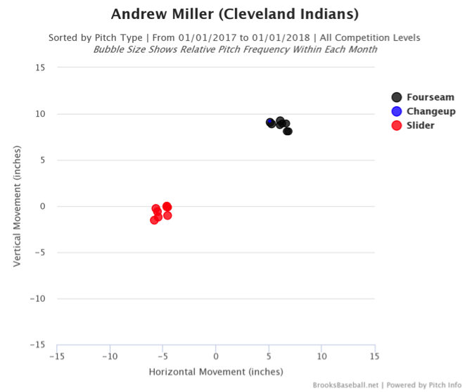
There you can see that Miller’s slider moved roughly five inches from his arm side to his glove side. That’s an impressive feat considering a ball thrown from his extreme arm angle naturally wants to move the opposite direction. What’s confusing, however, is that the pitch apparently has almost no vertical movement. Perhaps an inch or two of drop, but not much.
That simply doesn’t pass the sniff test. Looking at that GIF above, it’s clear the ball drops. This is where long-form movement really does a great job capturing reality:
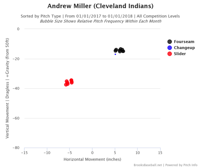
The long-form chart shows Miller’s slider with more than 30 inches of drop in the vertical plane, in addition to the usual horizontal movement. Now that makes much more sense, and generally matches with the video above. In this case, the long-form movement chart better captures the reality the batter is facing.
This isn’t to say that you should only use long-form movement charts or that short-form charts are bad. The point here is simply that the two charts do different things and tell different stories. Short-form charts are helpful when considering pitch mix and how certain pitches and their movement profiles work together. Long-form more accurately depicts the reality of the pitches a batter faces.
Both versions should be a tool in the tool box to analyze batter/pitcher performance. It’s important that we understand the purpose and uses of both in order to more completely understand the batter/pitcher matchup.
Thank you for reading
This is a free article. If you enjoyed it, consider subscribing to Baseball Prospectus. Subscriptions support ongoing public baseball research and analysis in an increasingly proprietary environment.
Subscribe now