This week's question comes from Sam Grossman, who writes:
What percentage of "quality starts" results in Ws, Ls and NDs for the starting pitcher? What about Ws and Ls for the team?
Has this been consistent across time (effect of bullpens, etc.)?
Thanks, Sam. A "quality start" is defined as one where the starting pitcher goes 6 or more innings and allows three or fewer runs. QS are fairly controversial, both for the usual sabermetric reasons that you aren't accounting for park effects, and because the stat doesn't distinguish between a nine inning shutout and a 6 IP, 3 R performance. Also debatable is whether a 4.50 RA (3 R/6 IP) can be considered "quality" (though this last point is somewhat muted in this high-offense era). Still, as a rough guideline, 6 IP and 3 R is a useful and easy-to-remember rule to divide starts into two broad categories. There are variations of quality starts which limit 6 IP outings to 2 runs, and allow a third run for 7 or more IP, but we'll stick with the simpler definition for our analysis.
If we think about the changes in the game over the past couple of decades, we can develop an intuition about what we suspect has happened with quality starts. A higher offense era should mean fewer quality starts (since the baseline for a QS doesn't move with changes in run scoring). Similarly, a greater reliance on the bullpen means that fewer pitchers would get a chance to go the requisite 6 innings, although a pitcher throwing well enough to qualify for a quality start probably isn't going to get yanked early. So we expect a lower percentage of quality starts in recent years, as run scoring and usage patterns have changed.
Thinking about the relationship on the outcome of the game is, in some ways, more interesting. As run scoring increases, not only do the total number of runs scored rise, but the number of innings in which runs are scored rises as well. Each half-inning where scoring occurs is another opportunity for the lead to change hands. If a lead change occurs after the starting pitcher is removed from the game, he can not get a decision. Therefore, increased scoring should lead to more no-decisions for starting pitchers, even in quality starts, because the bullpen determines scoring in the last couple of innings.
Team and pitcher winning percentages should be related. In high scoring eras, holding a team to 3 or fewer runs over two-thirds of the game is a greater and more rare accomplishment, and it is also less likely that the pitcher's counterpart is also throwing a quality start. Having a higher percentage of games where you lead going into the 7th inning (or later) will naturally lead to higher overall team winning percentages. Conversely in low-offense eras, a quality start isn't uncommon, and the pitcher is less likely to get the offensive support to overcome a 3 run margin. So team and pitcher QS winning percentages should be higher in high-offense eras, and lower in low-offense eras.
I've looked at starts between 1978 and 2000, and determined what percentage of them were quality starts. I also looked at the pitcher's winning percentage and no-decision percentage in quality starts, as well as the team's winning percentage. The results are shown in the table below:
YEAR    QS%     TQW%    PQW%    PQN%
1978    52.0%   66.3%   59.6%   19.5%
1979    46.6%   69.9%   60.5%   20.9%
1980    48.2%   71.1%   61.5%   20.4%
1981    50.0%   68.5%   58.3%   21.9%
1982    47.0%   69.2%   58.5%   23.4%
1983    46.9%   70.4%   60.6%   21.6%
1984    48.2%   69.5%   58.6%   23.2%
1985    48.0%   70.1%   59.9%   24.1%
1986    47.0%   70.6%   57.7%   26.5%
1987    43.4%   72.6%   61.0%   23.8%
1988    52.9%   68.6%   57.5%   23.7%
1989    49.8%   69.0%   57.4%   24.2%
1990    49.5%   69.4%   57.4%   25.7%
1991    49.8%   68.2%   57.1%   24.2%
1992    50.7%   68.4%   56.2%   25.8%
1993    47.1%   69.6%   59.0%   24.6%
1994    45.3%   70.8%   59.2%   25.9%
1995    43.6%   70.8%   58.6%   26.7%
1996    42.9%   71.4%   59.4%   25.5%
1997    46.7%   68.9%   56.5%   27.7%
1998    46.1%   70.6%   59.3%   25.5%
1999    43.5%   70.6%   58.9%   26.8%
2000    43.3%   71.0%   58.3%   27.9%
It's a little difficult to get much from the table alone. However, we can note that the percentage of quality starts is down in recent years. Fewer than half of total starts were quality starts in every season since 1993. You may also see a trend in the PQN (pitcher with quality start gets no-decision) as the percentage creeps up starting around 1986. Looking at graphs of the numbers may be more revealing.
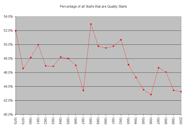
The chart above shows the percentage of all starts that were quality starts in each season. Two factors stand out; the first is the decline in QS% since 1992, corresponding to the beginning of the high offense era. The second is the huge blip in 1987-88. 1987 was, of course, the "rabbit ball" year: with higher run scoring, we would expect lower QS%, and the chart confirms that. The following season has the highest QS% of any year in the sample, perhaps because of an increased willingness to pull a pitcher throwing well before he gets into trouble. QS% remained higher through 1992, then began the current crash.
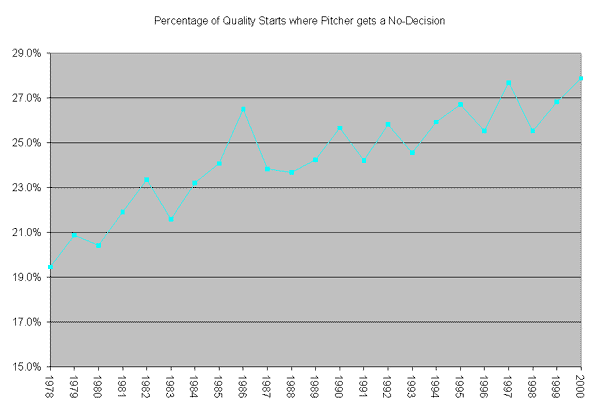
This chart confirms one of our intuitions stated earlier. No-decisions in quality starts have been rising steadily. The relatively constant slope of the chart suggests that it is pitcher usage patterns that have been driving this phenomenon; otherwise we would have expected to see a more dramatic change starting around 1993. The rabbit ball year of 1987 does stick out as an unusually high level of quality-start no-decisions for the time.
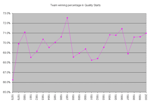
Team winning percentage in quality starts hasn't shown a consistent trend over time. The 1993-2000 era is higher than the 1988-92 span preceding it, which is consistent with higher offense causing higher team winning percentages in quality starts. However, 1987 and 1980 are the 1st and 3rd highest points in the sample, and there is a pretty compelling rise from 1981 to 1987 that doesn't (except for the final year) correspond to significant changes in offense. The crash in 1988 is reinforced by the observation earlier that the percentage of quality starts peaked in that season. When there are more quality starts to go around, it's less likely that getting one from your starter will be sufficient to win the game.
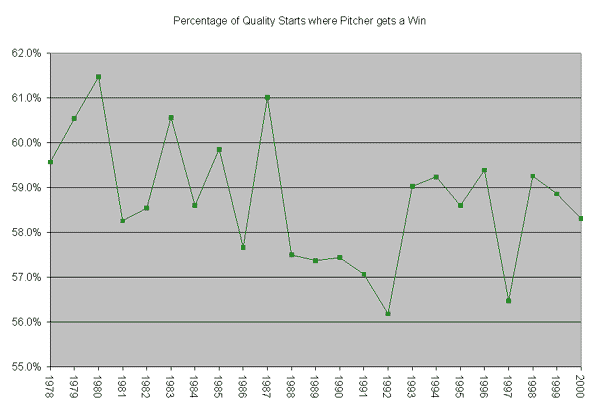
Our final chart shows the percentage of quality starts where the pitcher gets a win. Note that this is not winning percentage (Wins/(Wins+Losses)), per se, as higher no-decision rates will depress the Win/Quality Start number. However, this is still an interesting chart to look at. First, notice that more wins are credited to starters in the high-offense era of 1993+. The 5 years before that (1988-92) were the hardest for a pitcher to get a win when throwing a quality start. Two factors conspire to work against pitchers from that time period; the first is the lower run scoring compared to current era, and the second is the increased bullpen usage. A greater percentage of quality starts from 1988-1992 are probably 6 innings long, as compared to the late 1970's when pitchers were allowed (or expected) to throw deeper into games. Handling more of the game yourself makes you more likely to get a decision.
One interesting anomaly we see in all of the charts above is how 1997 stands out from the rest of the high-offense era, looking much more like a season from 1988-92 than post-1993. It would make an interesting research project to determine why it stands out from the years around it. A few pitchers having dominating years and skewing the QS results? Lower offense relative to the rest of the era? Is it a short-term hiccup in the trend towards using relief pitchers more? Any intrepid statheads want to take a crack at solving the mystery?
My thanks to Sam for this week's question, and keep sending your questions (and your solutions to the 1997 puzzle) to kwoolner@baseballprospectus.com.
Keith Woolner is an author of Baseball Prospectus. You can contact him by clicking here.
Thank you for reading
This is a free article. If you enjoyed it, consider subscribing to Baseball Prospectus. Subscriptions support ongoing public baseball research and analysis in an increasingly proprietary environment.
Subscribe now