The following article, written by Keith Woolner with Rany Jazayerli, appeared
in Baseball Prospectus 2001.
Table of Contents
- History of PAP
- Areas of investigation
- Short-term ineffectiveness
- Data set to be studied
- Performance measurements
- Endurance differences
- Initial results
- The Performance Index
- PAP vs. Performance Index
- Other PAP formulae
- Reformulating PAP
- Sample results
- Limitations of the Study
- Conclusions
The Pitcher Abuse Point system (PAP) first appeared in Baseball Prospectus
1999. Rany Jazayerli developed PAP as a common sense quantification of the idea
that a pitcher who throws high pitch counts is at significant risk for injury
and/or ineffectiveness. Research going back to Craig Wright’s "The Diamond
Appraised" has suggested a 100 pitch count limit for developing pitchers.
Abuse Points are awarded to a starting pitcher after he has thrown 100 pitches
in a start. At first, one Abuse Point is awarded for each pitch, but at each
successive plateau of 10 pitches, the penalty for each pitch rises by one. In
other words:
- Pitches 1-100: no PAP awarded
- Pitches 101-110: 1 PAP per pitch
- Pitches 111-120: 2 PAP per pitch
- Pitches 121-130: 3 PAP per pitch
- Pitches 131-140 4 PAP per pitch
- Pitches 141-150: 5 PAP per pitch, and so on
PAP totals are further adjusted by a factor dependent on age, reflecting the
relative immaturity and continued development of a young pitcher’s arm. These
adjusted PAP totals are referred to as Workload.
Since its introduction, PAP has proven popular as a way to assess a team’s
tendency to overwork its starting rotation. However, there hasn’t been the solid
sabermetric analysis to support any particular pitch count metric (including
PAP) to date. We will try to rectify that situation this year.
There are two related effects we are interested in studying. The original intent
of PAP was to ascertain whether a pitcher is at risk of injury or permanent
reduction in effectiveness due to repeated overwork. And in particular, does PAP
(or any similar formula) provide more insight into that risk that simple pitch
counts alone?
In addition to the long-term picture, there’s been an increasing awareness that
there are immediate effects of a long start. Pitchers appear to struggle for
several starts after being asked to thrown 130 pitches. Do long pitch count
outings reduce a pitcher’s effectiveness for a period of time afterwards?
In this article, we will focus on the second of the two questions, namely
whether high pitch count starts have a deleterious effect on a pitcher’s
effectiveness in the days and weeks immediately following. A separate article
examining the long-term risk of injury will follow.
Using data from The Baseball Workshop/Total Sports, I looked at all starts for
which there was reasonably complete pitch count data during the years 1988-98.
For each start, I looked at all starts by the same pitcher in the preceding 21
days, and the following 21 days, and tallied the aggregate performance for the
before and after periods. Note that the start itself is not part of either
group, so the fact that long starts tend to be of higher quality will not affect
the results.
I opted to look at 4 rates of performance to determine whether pitchers were affected by long outings. They are:
- Run average (RA)
- Hits per inning (H/IP)
- Strikeouts per inning (SO/IP)
- Inning pitched per game started (IP/GS)
IP/GS indicates whether a pitcher’s ability to throw late into a game has been
affected. H/IP and SO/IP indicate whether a pitcher’s "stuff" has been
affected, and RA is, of course, the bottom line as to whether a pitcher is
giving up more runs to the opposition.
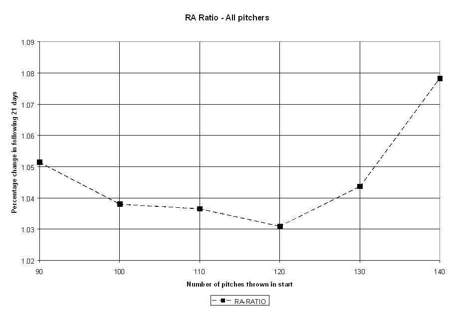
Let’s look at RA as an example. For every pitcher’s start, I computed his total
RA for all previous starts both in the 3 weeks prior, and the 3 weeks following.
The ratio of the RA(after) to RA(before) is greater than one if he gave up runs
at a higher rate following the start, and less than one if he was more effective
thereafter. I can compute the ratios for the other starts similarly. I grouped
all the starts in a given range, say 100-109 pitches, and aggregated their
before and after starts and computed the ratios. I plotted the ratios as a
function of the pitch count, as shown on the following chart:
(Click for full-size image)
The interpretation of the data this chart is that for pitch counts in the range
of 100-109 (X axis = 100) pitchers experience about a 3.8% increase in RA the 3
weeks following the start than they did in the 3 weeks immediately prior to it.
The chart shows both promising and surprising results. Perhaps most surprising
is that there is a persistent trend for pitchers to do slightly worse in the
later time period, regardless of the length of outing. There are several factors
that may account for this, including the general warming trend in most ballpark
climates between April and August, and the resulting boost to offense that
accompanies higher temperatures. Pitchers, on the whole, may simply wear down
over the course of a season, making the later time periods of any stretch appear
slightly worse. There is also a survival threshold that comes into play — after
a stretch of bad starts, a pitcher may lose his spot in the rotation (or be sent
to the minors). There will be few or no starts in the "after" period
of this bad stretch to look for a bounce, but the starts preceding the bad
stretch will have the bad starts figured into their "after" periods.
Regardless of the contributing factors, the important point to note is that the
baseline expectation is not a 1.00 ratio, indicating equal performance before
and after any given start, but rather a slight decrease in effectiveness across
the board in the weeks following an outing of any length.
Looking at specific points in the chart, outings of 130 or more pitches
certainly seem to result in worse run prevention in the weeks following. This is
consistent with the hypothesis of the negative short-term impact of high pitch
counts. However, the rest of the chart seems to indicate the reverse, namely
that pitchers are more effective having thrown more pitches, peaking with an
outing of around 120 pitches. It even appears that a 90-pitch outing is more
harmful to short-term effectiveness than a 130-pitch outing. Is this an
indication that pitchers benefit from a regular workload heavier than previously
thought, or is something else going on?
One possible explanation is that there are significant qualitative differences
between pitchers who throw 90 pitches per start, and those who throw 120 pitches
per start. Good pitchers are more likely to throw deep into a game, as are those
perceived as having more endurance. Pitchers with low pitch counts either get
lit up early, are considered fragile or lacking in stamina, or are being
carefully nursed back to health following an injury.
To investigate this possibility, I divided the pitchers into two categories,
based on how many pitches they were typically allowed to throw. For each
pitcher, I looked at whether the majority of his starts were above or below the
average number of pitches thrown by starters in that season. Based on that
ratio, I assigned him to "High Endurance" (>50% of starts above league
average pitch count) or "Low Endurance" (<50% of starts above league
average pitch count).
There are pronounced differences in the quality of pitchers in the two subgroups:
ENDUR  #PITCHERS   ERA    RA
HIGH        1105  4.06  4.28
LOW         1822  4.85  5.10
Given the differences in quality, we shouldn’t be surprised to find that high
endurance pitchers account for a dramatically larger portion of the starts above
100 pitches. Furthermore, the fact is that the number of pitches thrown is not a
random variable. Instead, it is primarily a managerial decision made, based in
part on the performance of the pitcher in the particular game. Indeed, high
endurance pitchers account for significant more of the long pitch outings than
the short pitch outings:
NP        % HIGH
70-79      39.7%
80-89      43.1%
90-99      56.4%
100-109    70.9%
110-119    79.8%
120-129    86.7%
130-139    91.2%
140+       91.2%
One obvious effect of this is that higher pitch count outings should be of
better quality, on average. The following table showing ERA and RA for starts of
a certain number of pitches confirms this:
NP     GS  #PITCHERS   ERA    RA
50    563        340  5.25  5.54
55    724        391  5.14  5.39
60    954        443  5.06  5.30
65   1359        504  4.87  5.11
70   1815        549  4.74  4.99
75   2349        588  4.74  4.98
80   2965        607  4.67  4.92
85   3582        620  4.61  4.85
90   4074        608  4.49  4.74
95   4365        596  4.43  4.67
100  4431        573  4.41  4.66
105  4086        531  4.28  4.52
110  3475        474  4.20  4.44
115  2645        418  4.14  4.37
120  2066        371  4.09  4.32
125  1381        299  4.05  4.25
130   817        226  3.96  4.15
While this data establishes the rather intuitive point that good pitchers throw
more long outings than bad pitchers, this isn’t enough, on its own, to establish
that the RA ratio chart above is affected. If both low and high endurance
pitchers both share similar proportional declines in performance. Let’s examine
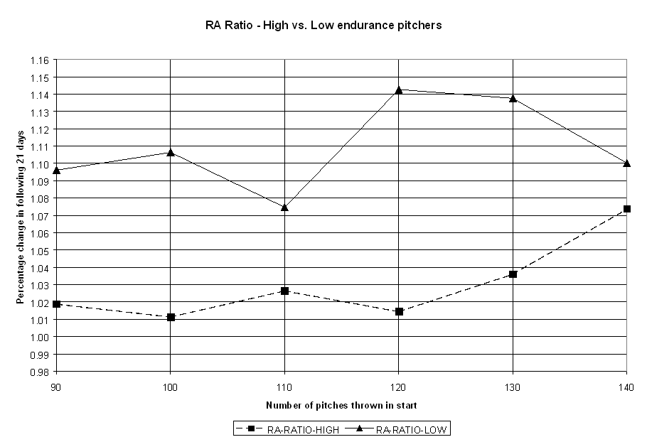
the pitch count data for each group:
(Click for full-size image)
Low endurance pitchers not only throw fewer pitches per start, but they decline
significantly more than high endurance pitchers do from start to start. In fact,
the best decline performance by low endurance pitchers is worse than the worst
decline performance from high endurance pitchers. In fact, we may speculate that
part of the reason that low endurance pitchers aren’t allowed to throw more
pitches is their inconsistency from start to start. Any effect from pitch counts
is being overwhelmed by their own inability to maintain a high level of
performance, as is evidenced by the erratic relationship between pitch counts
and short-term decline for low endurance pitchers.
This study, then, will focus on the short-term effect of high pitch count
outings among those pitchers regularly counted upon to throw deep into a game.
This makes practical sense, as well, as the controversy on pitch counts isn’t
about whether the Sean Bergmans of the world are being overworked, but rather
whether quality pitchers who are relied upon to pitch lots of innings, like
Kerry Wood, Livan Hernandez and Rick Helling, are.
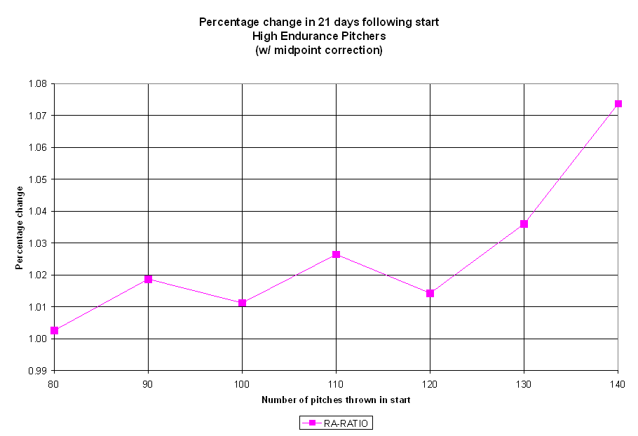
Let’s look again at the change in RA before and after a high pitch count start,
focusing only at the high endurance pitchers. Note that for the sake of clarity,
references to pitchers throughout the rest of this discussion will refer to our
high endurance subset of pitchers, unless specifically stated otherwise:
(Click for full-size image)
As you can see, there’s a strong trend for pitchers to allow more runs following
a high pitch count outing. A typical high endurance pitcher gives up 7% more
runs per inning in the three weeks following a 140+ pitch outing that the three
weeks immediately prior. Once again, those measures are:
- Run average (RA)
- Hits per inning (H/IP)
- Strikeouts per inning (SO/IP)
- Inning pitched per game started (IP/GS)
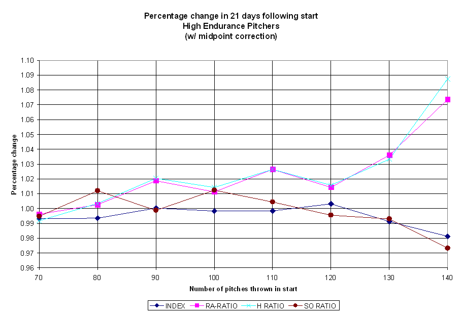
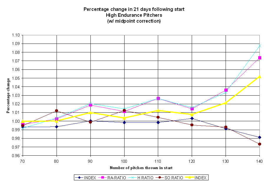
Let’s plot all four ratios against pitch count:
(Click for full-size image)
All four indexes are relatively constant in the 90-100 pitch range, but show
significant declines in effectiveness as pitch counts rise, particularly after
120 pitches. Note that the high IP and SO ratios mean the opposite as high RA
and H ratios — a decline in innings pitched or strikeout rate is bad, while a
rise in hits or runs allowed means trouble for a pitcher.
To estimate the overall effect, combining the effect of run prevention and
endurance with the leading indicators of pitcher dominance, I averaged the
ratios into a single "Performance" index. To get the "good"
direction pointing the same way for all of ratios, I inverted the SO/IP and
IP/GS ratios to make high values less desirable. The ratios, along with the
average index are shown on the chart below.
(Click for full-size image)
If we design a metric that is a function of the total number of pitches thrown,
and matches the shape of the curve shown above, we would have a reasonable good
indicator by which the cost of a long outing on near-term performance could be
measured. Notice that the shape of the curve is flatter at the beginning, and
gets steeper and steeper as the pitch counts get higher. This is clearly not a
linear trend, but a nonlinear (with increasing slope) function.
As it turns out, PAP was designed to show this same kind of behavior. It is
reasonable to wonder, then, how well PAP matches the observed shape of the
Performance Index.
For all of the performance metrics we will analyze, there are certain parameters
that define the metric maps to the Index curve. I have set all the functions to
match the performance index at the NP = 100 and NP = 140 levels, and observed
how the curve matches the shape of the points in between. The NP=100 level was
selected because it matches the first point of continuous decline in any of the
indexes, namely strikeout rate. Some of the other metrics may not show
substantial decline until higher pitch counts, but strikeout rate appears to be
an "early warning system" of trouble ahead.
Let’s begin with the original definition of PAP:
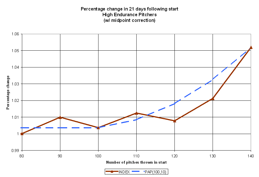
(Click for full-size image)
The classic formulation of PAP shows the right basic shape, but the slope does
not curve as sharply as the performance index does. It overestimates the effect
of a 120 or 130-pitch count outing.
Next, we should consider other functions that share the structure of PAP that
may a better match to the empirical data. I parameterized the PAP function so
that the threshold at which PAP starts to accumulate (originally 100) and the
step at which another Abuse Point accumulates (originally 10) can vary. For
example, we could investigate a PAP function that starts accumulating point at
110 pitches, with an increment of 5 pitches. We’ll refer to these modified
functions as PAP(THRESHOLD,STEP), as in PAP(110,5) or, for classic PAP,
PAP(100,10).

(Click for full-size image)
The reduction in the step from 10 pitches to 5 increases the slope, but does so
throughout the curve. The change of threshold to 110 pitches mitigates this, as
we don’t start the curve until later into the outing. Let’s look at another PAP
function, this time PAP(100,1) — that is, starting at 100 pitches, and adding 1
for the first pitch, 2 for the second pitch, 3 for the third pitch, and so on
for every pitch thereafter:
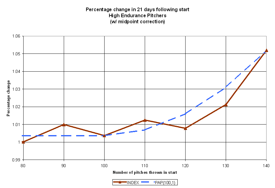
(Click for full-size image)
It’s evident that despite our best efforts, a PAP formulation that relies on the
semi-linear increase in abuse points doesn’t fully capture the relationship
between high pitch counts and reduced effectiveness. Let’s then look at other
nonlinear functions that show more dramatic curvature. A quadratic relationship
(PAP = (NP-100)^2 if NP > 100, 0 otherwise) is shown below.
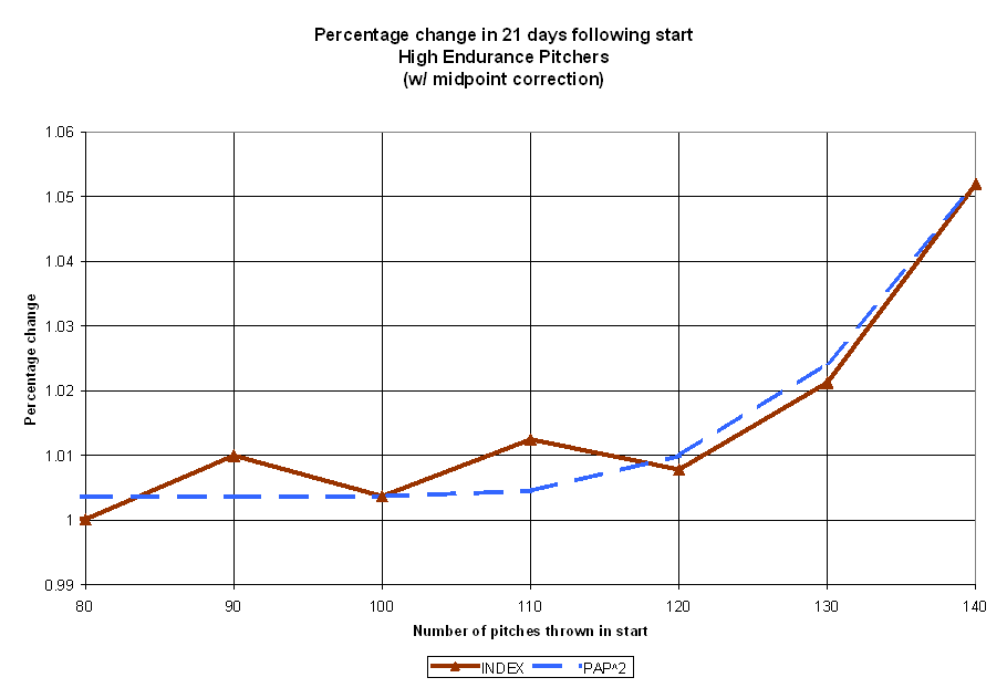
(Click for full-size image)
This shows some improvement, over but still not dramatic enough to really match
the curve in the critical 120-140 pitch area. Now, let’s look at a cubic
relationship (PAP=(NP-100)^3 if NP>100, 0 otherwise):
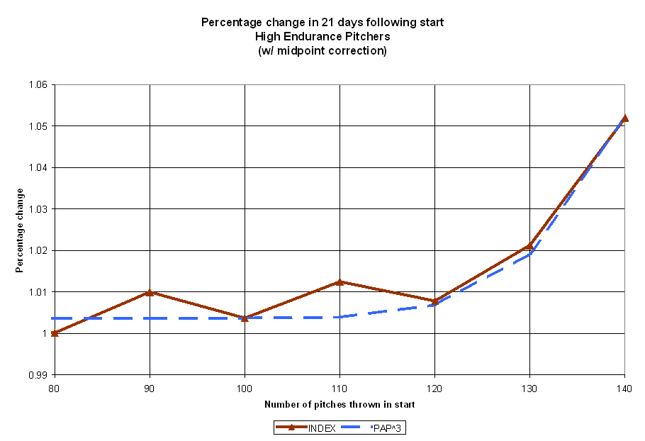
(Click for full-size image)
The cubic PAP function provides a near perfect fit with the overall trend in the
performance index. In particular, the fit between the value of 120 and 140 is
uncanny. We have discovered a simple mathematical relationship between the
length of a start, and the expected impact on a pitcher afterwards.
With the empirical data now at hand, Rany and I have considered some adjustments
to PAP. In particular, the cubic relationship between pitch count and
ineffectiveness needs to be built into the system. We’ll designate the system as
PAP^3, to distinguish it from classic PAP, and define it thusly:
PAP^3 = { 0 if the start has fewer than 100 pitches,

(NP-100)^3 if the start has 100 or more pitches

}
One may reasonably wonder how the PAP^3 system compares to classic PAP. I’ve
changed the scale of PAP^3 to match the range of PAP so that the differences may
be seen more easily in the table below:
 NP   PAP   PAP^3  ScaledPAP^3
 95     0       0            0
105     5     125            0
115    20    3375            5
125    45   15625           21
135    80   42875           59
145   125   91125          125
Generally speaking, PAP^3 is more forgiving on pitch counts between 100 and 135
than classic PAP was, though the penalties for going much above that level are
considerably steeper.
One unfortunate side effect of this reformulation is evident in the table above.
Though the formula for PAP^3 is simple enough, the numbers for PAP^3 grow large
very quickly. For example, a 129-pitch outing has a PAP^3 of 24389, but few
people would be able to cube 29 in their head. However, there is a mathematical
relationship that can help us out here – logarithms. While this doesn’t change
the nature of the underlying relationship, it does allow us to categorize starts
with smaller numbers. Group starts by the log of their PAP^3 totals.
Specifically, I’m using base 10 logs, not natural logs.
Log(PAP) Category  Pitch Range   Risk of Short-term Decline
     ---        I        0-100               Virtually none
     <=2       II      101-109                 Minimal Risk
       3      III      110-121                Moderate Risk
   4-4.5       IV      122-132             Significant Risk
   4.5-5        V         133+                    High Risk
For example, a 114 pitch count outing has a PAP^3 of 2744, and the log(2744) is
3.43, which makes it a Category III start. I used Roman numerals to designate
the categories simply to indicate that we are consolidating starts into broad
categories rather than precisely measuring a specific effect.
The categories are divided largely by the integer portion of LOG(PAP), except
between categories IV and V. Otherwise, the Category IV starts cover too broad a
range of expected risk factors (pitch counts of 122-146, or expected declines of
about 1% to well over 6%). Still, the categories are ultimately based on
empirical analysis, and should be easier to discuss sabermetrically, as in
"Livan Hernandez had 10 Category IV starts, and 4 Category V starts, which
is way too high. Dusty Baker needs to lay off."
For the 2000 season, the totals in each category are:
CATEGORY  #STARTS
    I        2592
   II         977
  III         885
   IV         346
    V          52
The individual leaders in each category for 2000 were:
- Category I starts: John Halama (26), Greg Maddux (25), Brian Anderson (24), Brian Meadows (24)
- Category II starts: Kent Bottenfield (15), Darryl Kile (14), Kevin Brown, Kris Benson, Jimmy Haynes, James Baldwin (12)
- Category III starts: Kenny Rogers, Sidney Ponson (15), Mike Hampton, Russ Ortiz, Al Leiter (14)
- Category IV starts: Randy Johnson (12), Livan Hernandez, Roger Clemens (10), Rick Helling (9), Randy Wolf, Jeff Suppan (8)
- Category V starts: Livan Hernandez (4), Randy Johnson (3), Rick Helling, Scott Elarton, Al Leiter (2)
We can also look at the "average category" of a pitcher’s starts. The
pitchers with the highest average category (minimum of 10 starts) are:
PITCHER               GS   AVG_CAT
Hernandez,Livan       33     3.152
Johnson,Randy         35     3.057
Leiter,Al             31     2.871
Williams,Woody        23     2.783
Wolf,Randy            32     2.750
Helling,Rick          35     2.714
Martinez,Pedro        29     2.655
Clemens,Roger         31     2.613
Ponson,Sidney         32     2.563
Stein,Blake           17     2.529
Mussina,Mike          34     2.500
Person,Robert         28     2.500
Pettitte,Andy         32     2.469
Schmidt,Jason         11     2.455
Hampton,Mike          33     2.455
Park,Chan Ho          34     2.441
Miller, Wade          16     2.438
Dempster,Ryan         33     2.424
Benson,Kris           32     2.406
Colon,Bartolo         30     2.400
Conversely, only one pitcher with 10 or more starts had all of his starts in
Category I: Dave Eiland. Others with low average game started category include
Todd Stottlemyre, Sean Bergman, Mike Johnson, Dwight Gooden, Brian Rose, Bronson
Arroyo, Jeff Fassero, Hideki Irabu and Pete Schourek.
We should interject a few notes of caution here. First is that we haven’t yet
established what PAP was originally designed to measure — risk of injury from
overuse. We’ve been investigating a related (and initially easier to assess)
phenomenon — short-term ineffectiveness following high pitch count outings.
PAP^3 should not, at this point, be used as a proven indicator of health risks.
At best, it should be taken as an early warning indicator that a pitcher is
being pushed too hard. It says nothing about whether a pitcher can fully bounce
back to his previously established level of performance given enough rest and a
more sensible workload. Another research article will have to address the injury
implications of heavy workloads.
It’s also important to remember that the aggregate performance index curve is
really the result of pitchers with differing capabilities, physiques and
endurances. Randy Johnson may be able to throw 130 or more pitches without ill
effects, while Jason Schmidt may suffer when asked to go more than 90 pitches.
However, it is difficult, if not impossible, with present record keeping and
medical knowledge to ascertain where a particular pitcher’s threshold is. The
PAP^3 system is an amalgamation of the performance of all pitchers, and is a
general indication of how pitchers, as a group, respond to workload.
Lastly, the PAP^3 formula has only been validated for pitch counts that range up
to 140-149. While this is mostly sufficient for recent seasons (starts of 150 or
more pitches amount to only 0.14% of all starts since 1988), there’s no a priori
reason to expect that the cubic relationship holds at, say, the 180-200 pitch
level occasionally reached by pitchers in years past. In fact, given the nature
of the system. Is a 180-pitch outing 8 times worse than a 140 pitch outing, as
PAP^3 would suggest? That implies a 38% decline in the pitcher’s performance
index, a truly gigantic amount, pushing a league average pitcher (say, 4.50 RA)
to below replacement level (about a 6.21 RA). The true estimate of very high
pitch counts may have to wait for historical pitch count data, or a change in
the game restoring the conditions of the dead-ball era, or at least the 1960’s.
How significant is the effect we’ve identified? Assuming a fairly abusive usage
pattern across a staff, a team’s starting rotation could suffer a season-wide
decline of about 2%. Considering the effect on both the innings pitched (putting
more strain on the bullpen) and extra runs allowed by the starting pitchers,
this might amount to perhaps 20-25 runs over the course of a season, which would
be expected to be about 2 to 2.5 games in the standings. That’s comparable to
the difference in value between Tim Hudson and, say, Kevin Tapani or Todd
Ritchie in 2000. That’s a trade worth making.
The implications for pitcher usage are rather straightforward; starting pitchers
should, in general, be held to 121 or fewer pitches (Categories I, II, and III).
There are some circumstances where this need not apply — if winning today’s
game is of significantly higher strategic importance than the pitcher’s next few
starts (e.g. playing a division rival during a pennant race). Also, if a manager
believes a pitcher is physically superior in endurance than other pitchers, he
may judiciously allow him to throw deeper into games. Naturally, the state of
the bullpen and the rest of the starting staff may also figure into the decision
— a 5% decline from David Wells is still a better pitcher than Roy Halladay.
However, even though extenuating circumstances may call for pushing a workhorse
starter to a Category IV start (up to 132 pitches), or even a low Category V
start, it should be viewed as nearly inexcusable to let a starting pitcher
exceed 140 pitches in any start.
Managers who allow pitchers to throw too many pitches in a start may not be only
jeopardizing that pitcher’s future, but hurting his current team’s chances at
success as well. For the benefit of another half inning of work from a tired
starter, a manager may be gambling with that pitcher’s next 4 or 5 starts at the
very least. The evidence shown here shows that a season-long strategy to
maximize the effectiveness of a pitching staff through managed workloads makes
sense, even under an urgent "we need to win now, the future will take care
of itself" philosophy.
Keith Woolner is an author of Baseball Prospectus. You can contact him by
clicking here.
Thank you for reading
This is a free article. If you enjoyed it, consider subscribing to Baseball Prospectus. Subscriptions support ongoing public baseball research and analysis in an increasingly proprietary environment.
Subscribe now