Some of the more commonly accepted platitudes in the sport are that expanding the zone is bad for a hitter, and swinging in the zone is good. To quantify these concepts we use statistics like Z-Swing%—swing rate at pitches within the zone—and its inverse, O-Swing%, which shows us the rate of pitches outside the zone a hitter chases. Some analytical minds have even taken this a step further and combined the two for a Z-Swing minus O-Swing statistic that performs fairly well at grading a player’s swing decisions and sense of the strike zone.
But I find that even the combination of these statistics doesn’t sufficiently capture what we’re looking for when it comes to quantifying a player’s skills at the plate. A hitter’s skill set isn’t just knowledge of the zone; perhaps more importantly, it’s knowledge of what pitches they can work with and what pitches—even strikes—they cannot. A pitch outside the zone could be a bad one to swing at for one hitter, and a good target for the next; swings are far from uniform, so the way we evaluate them shouldn’t be, either.
So, I set out to find a different way of measuring discipline, one with context dependent on individual hitters. For this I used a simple baseline to form a hitter’s desired swing area—their “hot zone”—an average of the locations for the hardest 20% of batted balls a hitter has. Then it was a matter of dividing their swing choices into good or bad based on how close their swings/takes were in Euclidean distance (a straight line) to their hot zones and seeing who came out ahead. Visuals always help with comprehension, so here’s what that looks like in plot form for the league average, generic hitter:
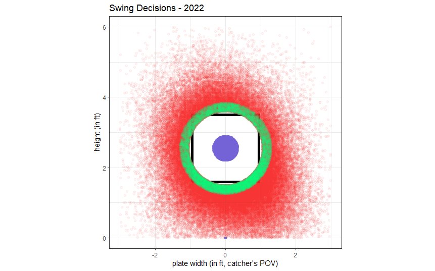
Let’s assume this player’s hot zone is the purple, right in the heart of the plate (this isn’t the case for everybody, FYI). Everything in the red area would be called a “bad swing” because it’s too far from where this hitter can do his most damage. Every pitch taken inside the purple area would be called a “bad take”, except for those in 3-0 counts (since that’s not always a hitter’s decision to make), as these are missed opportunities. The green zone is the 2-strike area; swings here would normally be considered bad, but in a 2-strike count the hitter shouldn’t be quite as passive and must guard against the backwards K; takes are considered poor in this specific context when they come within the general radius of the strike zone relative to that player’s hot zone.
And that’s essentially the gist of what we’re after. It’s just a slightly more nuanced version of the same concepts that have existed since the advent of pitch tracking: swings inside/outside ideal areas of the plate for a hitter, only now we’ve contextualized that zone for everyone’s strengths and weaknesses and added some count effects.
Once these good and bad takes and swings are tallied, they form a “bad decisions” rate (bad takes + bad swings over total pitches faced) that performs nearly as well on its own as Z-minus-O Swing is as a combination of multiple statistics, with an r of -.218 vs .249 against same season OPS. Meaning that a higher rate of bad decisions has nearly as much of a negative effect on a hitter’s OPS as a high Z-minus-O Swing% benefits a hitter’s OPS.
So without further ado, the Best and Worst Decision Leader(and er, trailer?)boards for 2022:
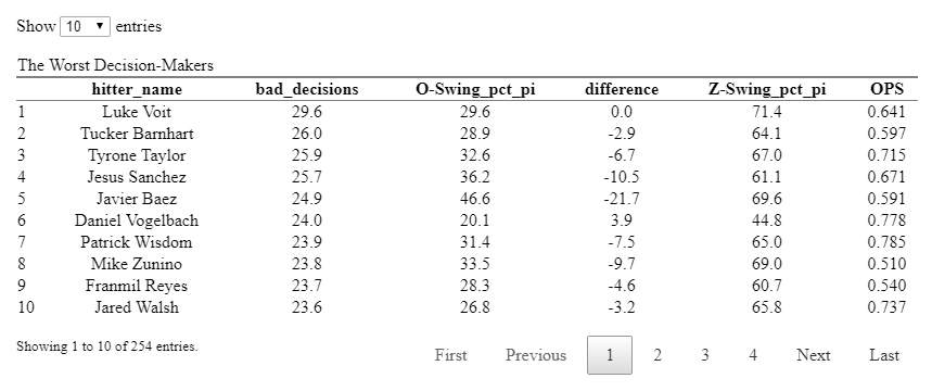
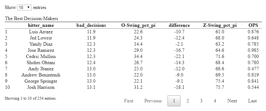
There is at least some immediately encouraging confirmation that players with proven plate skills like Lowrie, Diaz, and Jose Ramirez rate very highly, and that established “free swingers” who carry a high O-Swing% are found to also be those that make the worst decisions most often (looking at you, Javy Baez). But there are also some notable contrasts between the measures that can illustrate how this line of analysis differs from looking at an O-Swing% leaderboard.
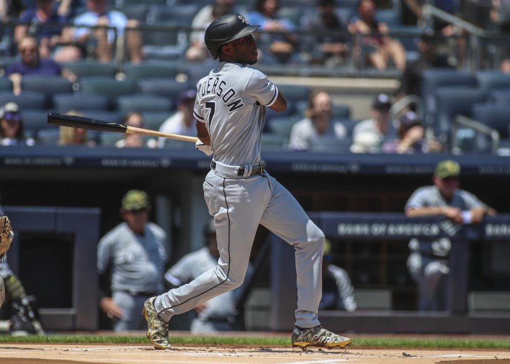
For example, the player with the largest difference between his O-Swing% and his bad decisions% was Tim Anderson: Anderson has an O-Swing% of over 40%–one of the highest in baseball–but a bad decisions rate of only 15.6%, which is one of the best. To see how that large of a gulf is possible, let’s look at the locations of each pitch Anderson has seen in 2022 and how those were rated as swing decisions:
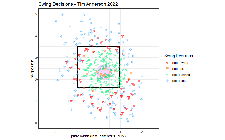
We see that Anderson, a righty, has a concentration of green off the edge of the plate down and away, meaning these are considered good swings for him despite not being strikes. This is because his hot zone (the center of which is the purple-ish circle) is offset down and away from the heart of the plate. All those swings below the knees and off the plate that drive up his O-Swing% are safely within an area his swing is best equipped to handle. What would be considered as chases with poor chances of success for other hitters are Anderson’s bread-and-butter, which is part of what makes him such a difficult out and adaptable hitter. Swinging in these locations will never be a bad idea for him.
As an inverse example, take Daniel Vogelbach: he has a microscopic O-Swing% of 20.1% yet has one of the highest bad decision rates in the league at an even 24 percent. How could this be possible? His plot:
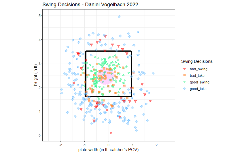
One of the first things you might notice is the concentration of orange in the middle of Vogelbach’s plot compared to Anderson’s. There are also decidedly fewer of the red triangles that represent poor swings. This is because Vogelbach’s bad decisions mostly aren’t the result of what he swings at, but rather what he doesn’t. He simply watches too many crushable pitches go by in his nitro zone or on the edge of the plate in 2-strike counts: nearly half–14 out of 32–of his strikeouts this season have been a result of called third strikes. Those backwards Ks are the orange squares dotted around the edge of the strike zone, with the rest of his bad takes concentrated in and around the area where he should be doing his most damage. This passivity is how a player with an uncanny sense of what is or isn’t a strike hasn’t been able to capitalize at a rate commensurate with his combination of power and patience.
There is further validation to be done on this “bad decisions rate” statistic, but I think there’s value in adding context to each evaluation of a player like this. I look forward to providing updates using this method in the future.
Thank you for reading
This is a free article. If you enjoyed it, consider subscribing to Baseball Prospectus. Subscriptions support ongoing public baseball research and analysis in an increasingly proprietary environment.
Subscribe now
There's a lot of cool stuff that could come from this data--relationships between good decisions and barrel rates, etc, looking for possible breakouts. Thanks.