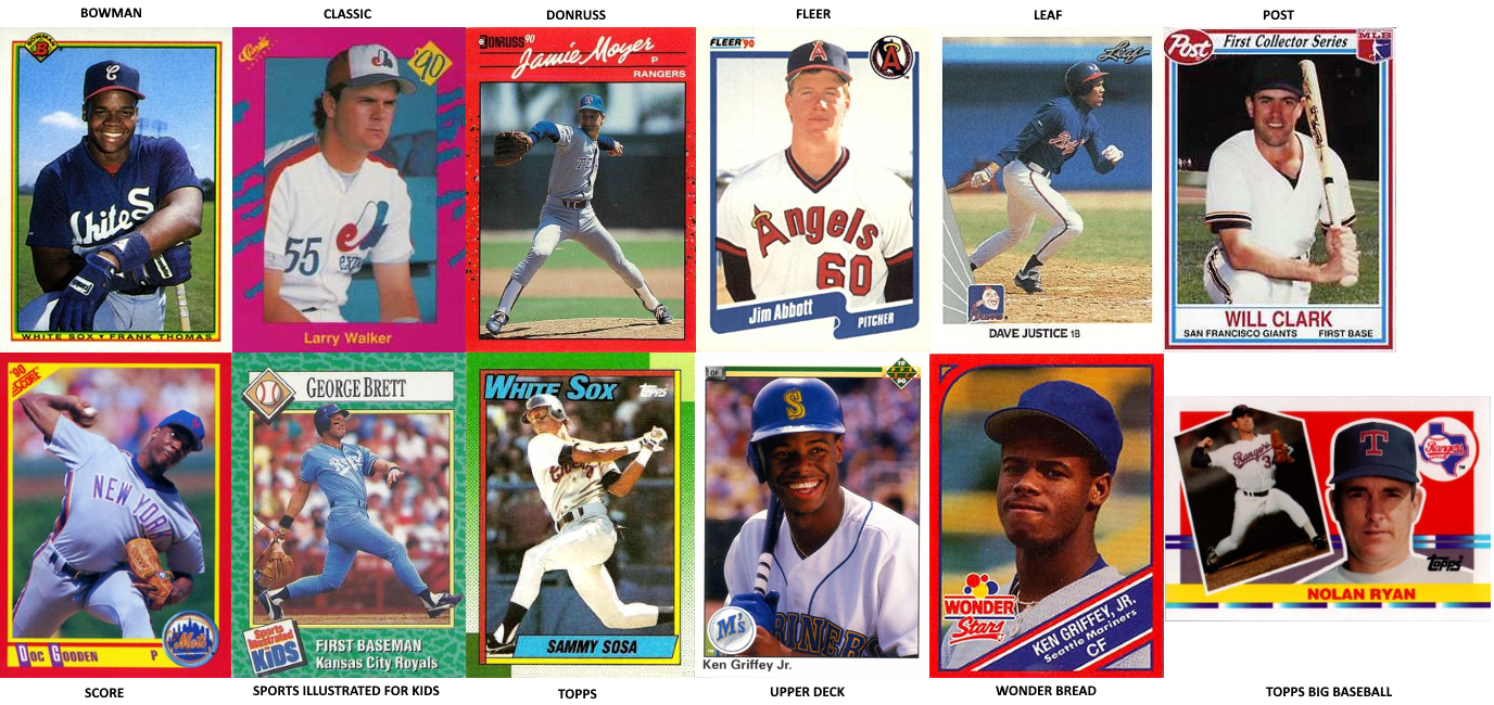
Patrick: The time has come for us, the arbiters of taste, to establish for history the relative merit of the design of 1990 baseball cards. I’ve selected the major card companies and a few oddballs and mandated that the Short Relief crew gaze upon them, welcome each individually into their hearts, and pass judgment. (Please note: cards that replicate the same border from year to year, like Toys R Us or Mother’s Cookies, were omitted from this exercise. It is 1990 specifically that we want to rate.)
Before we discuss individual designs, I want to say for the record: these are, on the whole, remarkably bad. 1990 might be the absolute nadir of baseball card borders, such that I might be forced to choose 1988 Topps over all twelve of them. Which is sad, because there are probably more of these cards locked in people’s memories and attics than any other year – we’re in the height of the junk wax era. This is what people are going to remember about you, baseball cards. You all failed.
Does anyone want to start by championing any of these designs? Is there anything good to mine from this disaster?
Jason: Everything everyone says after this is wrong because baseball card aesthetics only exist in their specific context. Nothing we are arguing about is real. It’s important, to be clear, but it’s not real, and therefore our statements of opinion (or, in my case, fact) are also not real. Something can’t be right if it’s not real. QED.
That said, the Topps are beautiful and I would wear entire outfits modeled on the blocky color situation they have going on. The text on many of the others is simply too small.
Holly: For me, the card that most thoroughly showcases its subject, in the least intrusive way possible, is preferable. The Upper Deck Griffey, therefore, is to be lauded. The card is not about the card, but rather about Griffey’s face and grin and the blue-blue-blue of that Mariners era, of the sea, of what is good and true and beautiful.
Patrick: OK, that’s great, but what happens when it’s a card of Bob Hamelin?
Rachael: I was born in 1997, and am thus gazing upon these wonders with entirely fresh eyes. I have to concur with Holly. The Upper Deck Griffey is by far the most appealing of these. It lacks the obtrusive bordering that most of them feature, and rather than making the central image either an unflattering action shot or a somehow more unflattering straight-on posed portrait, it instead features a shot that really seems to get to the soul of the player. I also appreciate that it’s not openly shilling for any kind of brand.
Jason: I stopped reading at “1997,” sorry. I’m extremely angry online now.
Mary: I am also gazing at these with fresh eyes, and I’ve got to say, the Classic is growing on me. If we want these cards to tell a story or to be instantly recognizable, it’s really the clear choice. Nothing is more ‘90s than it.
Zack: The Classic is the Zubaz of cards. The apotheosis of early ‘90s style, and truly worthy of its name.
Jason: The Classic is so on-the-nose, though, that it has come to seem like a parody. That’s the card you’d design now if you wanted a kitschy throwback 1990 card.
Matt S: I’m preferable to the Donruss concept one because, well, I remember it the most, but it looks like a homework assignment in which a baseball player was asked to paste a picture of himself onto red construction paper.
Patrick: If you’re really looking to tap the zeitgeist of 1990, what better callback is there than cursive?
Emma: I too love the Classic for that aggressively ‘90s color scheme, but let me also submit the Topps as one that managed to capture its specific moment in time really well. The electric blue block letters are so great—very fun and very of the decade, but not in a way where they dominate the whole card or feel over the top.
Trevor: When I look at the Donruss card and its tasteful yellow scrawl, I feel like I’m looking at my class binder, or some sort of award I was hastily given for perfect attendance because I couldn’t master any of the Presidential Fitness challenges. It’s my favorite because it feels just like the cardstock that I would treasure for 30 seconds before throwing away or losing.
Trevor: Meanwhile the Topps Big Baseball cards make me furious, as they are like the McDonald’s toy version of a real toy: disappointing and small.
Patrick: I get what Topps Big Baseball is going for, a 1955 vibe, one of their most beloved layouts. And emphasizing the headshot is fine to me, in a kind of old-fashioned way. But this is the third and final edition of the set, and you can tell they were trying to spice things up. Those backgrounds are infuriating. Compare it to the original 1988 version, which is pretty great. Even baseball cards should never be allowed to grow old, apparently. Or at least hit adolescence.
Kate: I think what ruins the Topps Big Baseball one for me is the saturation of the background colors with the chalky white outline. This looks like the baseball card equivalent of a paperback mystery left in a beach house in the Outer Banks.
Zack: I do like the block letters and blue ribbon with the name at the bottom of the Topps here (and even more because the featured card is my favorite player ever), but I just abhor the border. Three different green hues, two gradations: it looks like an optical illusion. In contrast, the Fleer’s simplicity is appealing to me.
Also, did Upper Deck just have much better photographers or is the Griffey photo an outlier? Because that is a beautiful image.
Patrick: Upper Deck cards had higher production values all around – they tended to cost twice as much per pack as the other brands. But lest you be followed by the Kid’s natural charisma, I’ll offer some evidence that the Upper Deck photographers, talented as they were, weren’t always on their A-game.
Kate: To expound upon that point, this exercise was difficult for me because they weren’t all images of the same player. As a Mariners fan who grew up during the lone sweet spot of that franchise, the Upper Deck card of course had an instantaneous magnetic pull I had to try to fight–the beatific grin of Saint Griffey, plus all those sweet nostalgia endorphins from the old-school Mariners logo before the Great Teal Wars of the 90s. The clean lines of the Upper Deck card work well for Griffey, who is arguably the most handsome guy up there. I tried to just focus on the border when ranking the cards, but sometimes it’s too tempting to consider how the subject relates to the background. For example, I am extremely amused by the juxtaposition of a glowering Larry Walker looking like he’s doing the worst guest appearance ever on Saved By the Bell.
Patrick: I picked different players because I… okay, I didn’t really have a master plan. Well, except Gooden, because he’s italicized the opposite way from the font of his name, and I thought that was funny. But one thing I feel like we’re not talking about here is the real darkhorse: SI For Kids.
Kate: Okay, I protest the inclusion of the SI For Kids “card.” This is not a card. It was a perforated sheet that you had to punch out of the magazine, and you never got the perforations right, and so the card came out with weird peaks and valleys and places where the top sheet has peeled away from the rest of this ersatz, sham “card.”. Which is fine! Children ruin things, so why not give them pre-ruined baseball cards. But if this is a baseball card, then the recipe for sausage rolls my mom tore just out of her Taste of Home is a baseball card, too.
Patrick: You… you know you could just use scissors to cut the perforation in a straight line, right? Perforation is a suggestion, not a requirement. Besides, it’s a 2.5 x 3.5 inch cardboardish picture of a baseball player. That’s all you need to qualify.
Kate: First of all, not all of us were allowed easy access to scissors, especially those of us who liked to cut our own bangs. Secondly, why involve a middleman when clearly Big Magazine was telling me to tear it out myself, like Scholastic News had trained me to do? Finally, cardboardISH is not cardboard, like when I went to my college cafeteria, pointed at a dish, and asked, “is that chicken?” and the women scooping it out responded, “kinda.” “Kinda” is not chicken, and it’s not a baseball card.
Kate: Plus, that card is the worst designed of the lot, on a purely functional level. There’s nothing that is recognizable as George Brett on this card. The player picture is small, the text is tiny, the only recognizable logo is the SI one. From a distance the impression is that a blue-clad homunculus named GraBrah plays for a team called the Kids.
Patrick: I still think it’s charming to have a baseball card with a little baseball on it. You know, as a reminder.
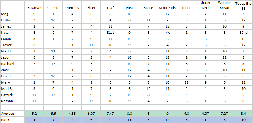
Patrick: Anyway, the final rankings are in, and although I think you guys made some bad choices, the top of the rankings are pretty acceptable. I’m not sure why you’re all okay with “rainbow border, but also with none of the good colors of the rainbow included,” but:

There we have it. Upper Deck, Donruss and Topps are our top three, while the oddballs, Topps Big Baseball, Post and SI for Kids, finish last. The mediocre Post and Wonder Bread garnered the most consensus, and Classic proved the most divisive. Dark times indeed, but 1991 would get better. We’d get Stadium Club, and Fleer ProVisions, and Zelda: Link to the Past. If there’s anything to take away from this exercise is, take this: no matter how teal-leopard-print the present seems, there’s always the possibility of an over-serious black-and-white studio set around the corner.
Thank you for reading
This is a free article. If you enjoyed it, consider subscribing to Baseball Prospectus. Subscriptions support ongoing public baseball research and analysis in an increasingly proprietary environment.
Subscribe now